Smart Health Care Dashboard
Leveraging user research to improve the dashboard of a IoT health care product for elderly incontinent patients and their caretakers. The research and design mainly focussed on the caretakers, with the goal to support them in their daily work with patients.
As the project was done at Henkel, some info has been hidden or changed. This case study reflects the design process, but the content is not necessarily the same as the real case.
Team: 1x UX Designer, 1x UI Designer, 2x Product Managers
Role: Research & UX Design
Tools: Miro & Figma
Re-evaluate & re-design a health care dashboard
Incontinent elderly patients need extra care, but their caretakers, especially in caring homes or hospitals, don’t always have time to dedicate enough time for each of them. To address this issue, a three-part IoT product was developed by Smartz and Henkel. The goal was to help the caretakers in their busy work routine, by monitoring the patient’s temperature, movement and moisture status, while offering the patient the opportunity to receive better care and attention.
The product was already used by some elderly caring facilities, but the digital dashboard has usability issues and needed a re-design. The existing dashboard was complicated and incomprehensive. Resulting in users needing more time to understand and navigate, while losing time to take care of the patients.
The business team wanted to re-launch a user-friendly product that can be distributed in hospitals and caring homes in Europe. They approached us with the task to evaluate the dashboard, so they can assess how to continue with the project. The team, an UI design colleague and I, evaluated, tested and re-designed the digital product for both and mobile and desktop. As the UX designer I conducted the usability testing and based on the findings gave informed design recommendations.
Digital dashboard for caretakers
While there are two user groups are using the product set:
patients wearing the adult diaper with the IoT device,
caretakers putting on the diaper with the IoT device on their patients & using the dashboard.
Our goal was to redesign the digital dashboard, therefore we only focussed on researching and designing for caretakers.
The biggest problems of caretakers is the lack of time and lack of personell. It's always challenging to dedicate enough time to each of their patients. The goal of the product was to give patients comfort, by helping the caretakers to monitor their patients body comfort level (moisture, position, temperature etc.).
Insights into a caretaker’s world
I conducted market research of similar products and usability testing with the existing product. My goal was to understand caretaker’s work routine, identify their biggest pain points and what they need to make their work easier.
Key insights
Two sub user groups: There are two sub groups among the caretakers, each with different needs and goals: caretaker & management
No time: Time is a crucial factor in the work day of a caretaker.
Not digital: Lack of digitalization is a problem in most hospitals and caring homes.
Busy bees: Caretakers are constantly on the go and they don't always have a work phone/tablet/laptop provided for them or they don't have the time to check their work phones.
Caretaker’s daily journey map
Understanding and mapping out the daily work routine of a caretaker, helped me address their pain points and possible touchpoints with the products.
A day of a nurse (morning shift)
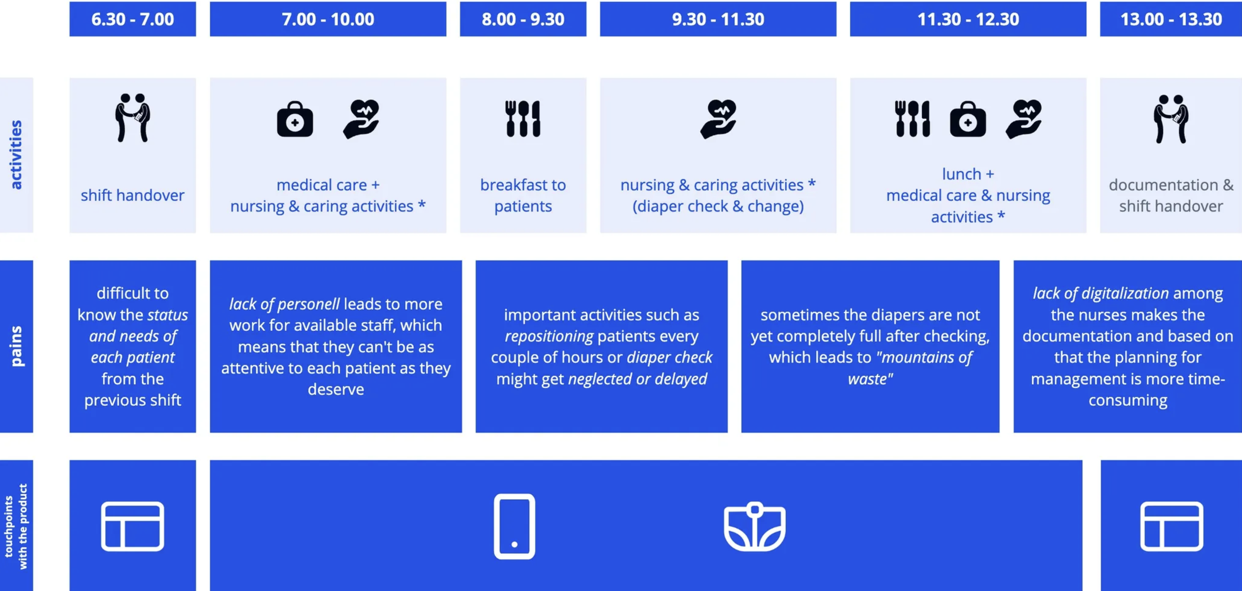
* among others repositioning of patients, toilet & diaper round
Design opportunities
Looking at the key insights and the caretaker’s daily journey map, it became evident that the dashboard needs to be split into two views: nurse (or caretaker) view and management view.
The caretakers, who are constantly on the move and only have limited time, need a quick way to remotely check on the health and body status of their patients. Having a mobile-only version for caretakers can support them in their daily work. The interface should focus on displaying the health status of individual patients, and focus on notifications and alerts to remind them of their actions to be done.
The staff management of nurses and caretakers need a dashboard showing statistics of all patients’ health conditions, as these information support them in their planning and coordination activities.
A small selection of the design recommendations
Separating the dashboard into two views and only showing what is truly helpful for their work and eliminate the information that are irrelevant, can help them save time and achieve their goals.
An adjusted version of the prototype
After presenting our evaluation and redesign to the business team, the project was passed on back to the business. They decided to re-activate the project to improve usability of the dashboard and to improve the IoT product as a whole.
Two main takeaways
The user recruitment was challenging
Due to restricting resources, we tried to recruit from our personal network and extended network first, but it turned out to be more difficult than anticipated. After weeks of unsuccessful search, we turned to an external agency. We should have hired an agency early on and spend more time on test preparation and UX work.
Environment-induced accessibility issues.
Accessibility was another challenge. Due to the busy and noisy nature of a caretakers work environment, they have temporary accessibility issues. Their might not always see everything on their phone. It was important to keep this in mind while and make crucial health status information as visible as possible.