Increase conversion of a D2C e-shop
Leveraging UX research to optimize usability and improve conversion for a D2C e-shop.
As the project was done for foodspring, some info are hidden. This case study reflects the process but not the content.

Team: 1x UX Designer, 1x UI Designer, 2x Product Owners
Role: Research & UX Design
Tools: Figma, Maze & Miro
Challenge
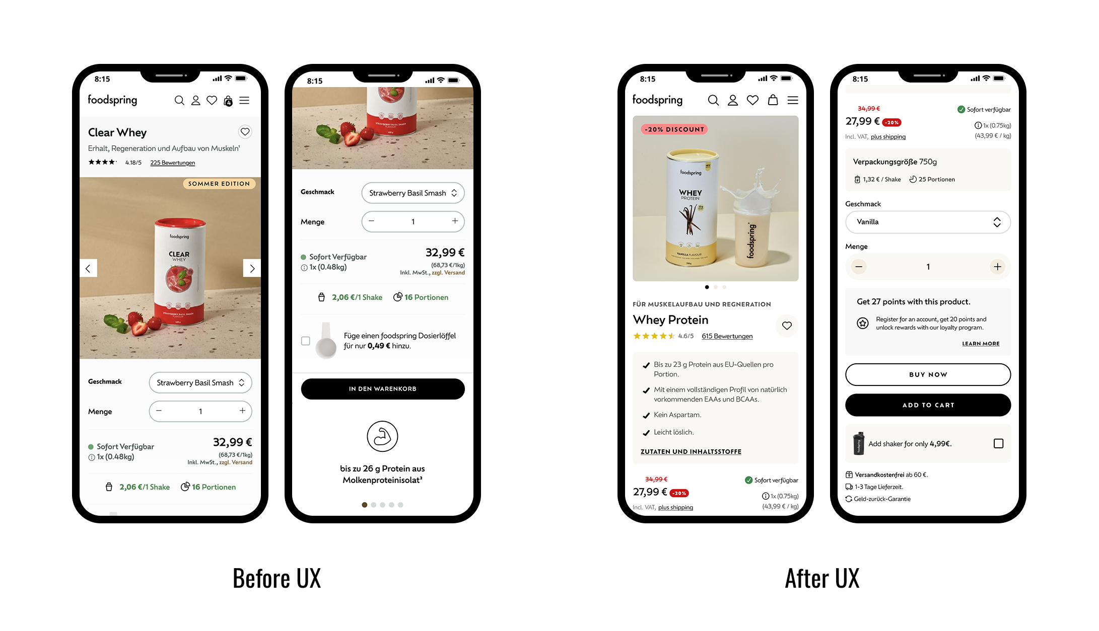
Foodspring, a protein product company, wanted to optimize its D2C shop experience to better convert casual visitors into loyal customers. It had a solid brand and sales performance, but faced competitors with more polished UX and stronger conversion metrics. Key pages, such as PDP and checkout lacked clarity, consistency and trust, affecting buyer decisions, especially for new or casual ones.

Role & Contribution
As a freelance UX Researcher & Designer I led a UX review and redesign of core pages (PDP, PLP, shopping cart and checkout) to improve conversion and usability issues. I also conducted user interviews and created personal profiles to understand different pain points and needs. Guided prioritization of JTBD was aligned with quarterly OKRs. I created user-tested solutions that improved transparency, purchase confidence and alignment with business goals.
Approach
Review: uncovered clutter, inconsistent navigation and insufficient clarity.
User needs: understand the users and their pain points.
Wireframing: Iterative redesigns of the PDP, PLP, shopping cart, checkout.
Usability testing: remote A/B testing of prototype variations via Maze with representative user groups.

Persona cards based on user research

User journey map
Proposed improvements
Highlighted features in key pages: high-quality imagery and clear benefit messaging above the fold in PDP, structured checkout process,
Users reported greater clarity in value proposition, higher trust in product benefits and improved confidence in buying decisions.
Note: Even though the brand’s closure prevented full implementation, these insights are strong levers for conversion improvements.
Insights & Learnings
Above the fold matters most: information presented visibly at first sight for the user will influence their decision-making and conversion behavior.
Trust is build with clarity: transparency in information, such as ingredients, product benefits and price matter for user’s trust in the product.
When business and design priorities are aligned with OKRs and JTBD, UX issues can be clearly targeted and measured in impact.